Magazine AD Design
Project Brief
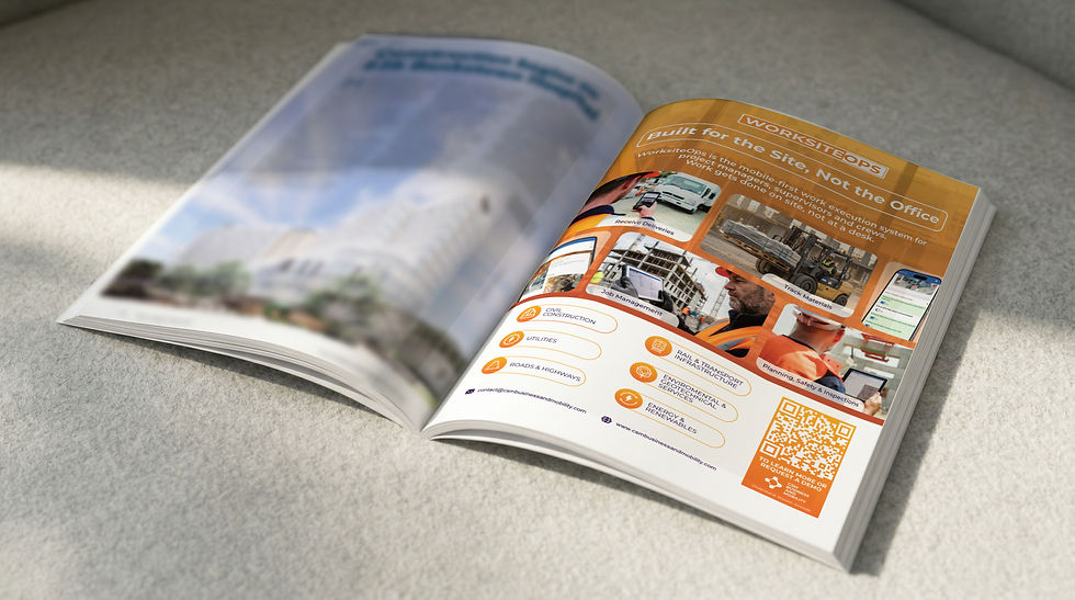
Create a print advertisement for the Q1 edition of Infrastructure Magazine (due 16 February) to support an overview article on WorksiteOps. The ad should communicate WorksiteOps as a mobile-first work execution system designed for project managers, supervisors, and on-site crews, reinforcing that work is completed on-site rather than in an office. The concept can explore a sequence of 3–5 visuals representing a day in the life of a site worker, highlighting typical activities such as capturing delivery information, conducting inspections, handling materials, and reviewing project plans. The advertisement should reflect relevance across sectors including civil construction, roads and highways, rail and transport infrastructure, utilities, energy and renewables, and environmental and geotechnical services, and be delivered as a high-resolution, print-ready file suitable for magazine placement.
Design Decision
I designed the advertisement around a simple idea that work on infrastructure projects happens on site, not behind a desk. The layout was developed as a sequence of moments from a typical workday, creating a clear visual flow while showing how tasks like capturing information, conducting inspections, moving materials, and reviewing plans happen directly in the field. The design was kept consistent with the WorksiteOps brand identity, with colours and typography aligned to existing brand guidelines. The overall style was developed to feel cohesive with other brand touchpoints across print and digital platforms, ensuring the advertisement integrates seamlessly within the broader brand ecosystem.


Flyer Design
Project Brief
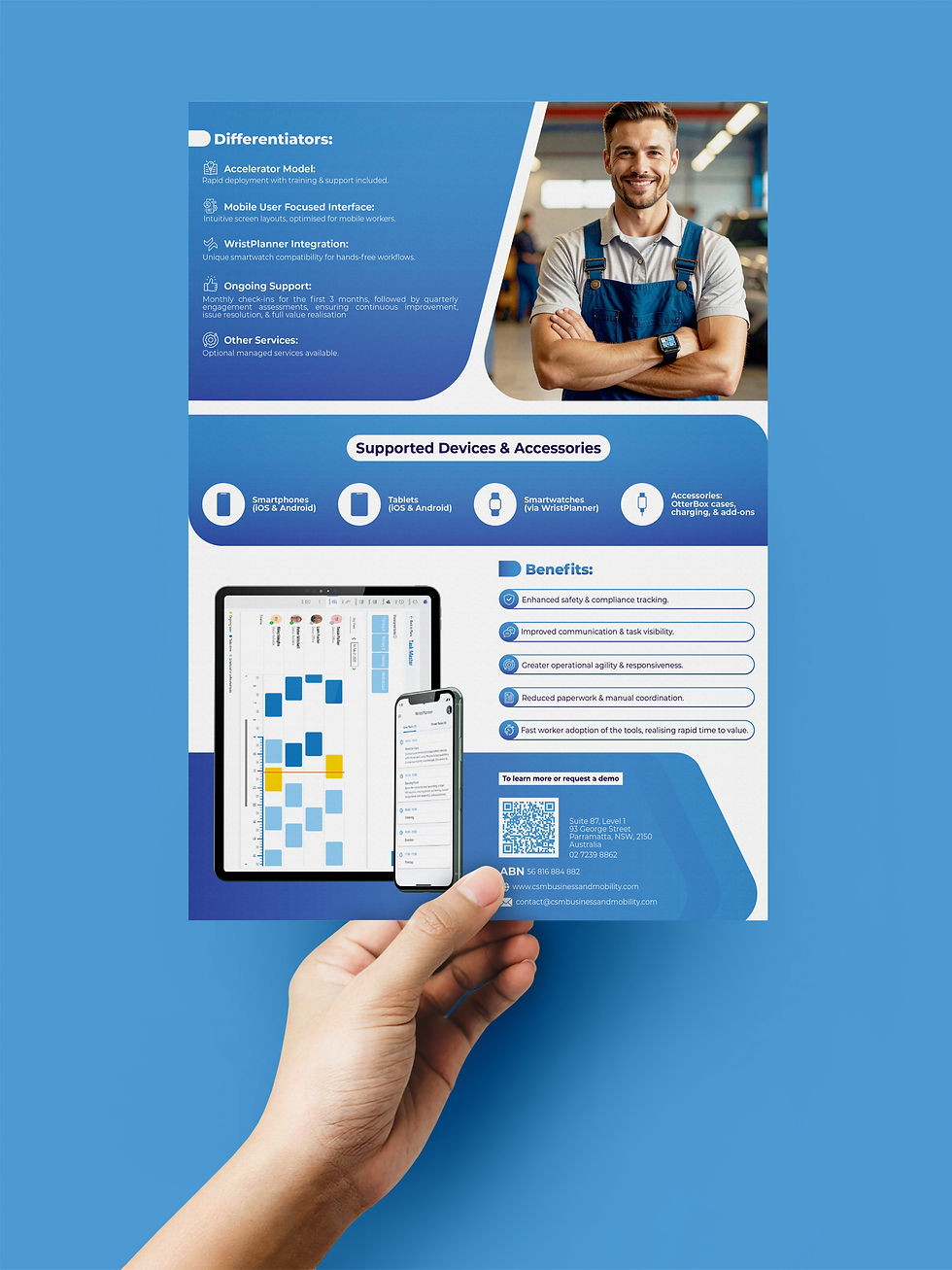
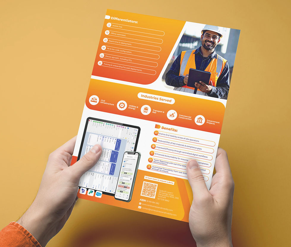
Create double-sided flyers for three capability statements: one business capability statement and two product capability statements. One design layout same for all three. The client provided text files and a headshot for the business capability statement. There was no strict styling or color scheme specified, only a preference for portrait orientation. Guidance included using similar imagery, website positioning, and brand logos as in previous banners, and including a footer with ABN, phone number, address, and optionally a QR code linking to the company’s LinkedIn page. The client suggested reviewing one flier first before applying the style to the others.
Design Decision
I designed the flyers with a consistent, professional layout aligned with the client’s brand identity. Portrait orientation was maintained, with a clean hierarchy separating headings, body text, and key features. Colors were taken from the client’s website, keeping the fliers consistent with their brand palette. The footer included all required company information along with a QR code linking to their LinkedIn profile. Images were chosen to complement the content and reflect the business and product context. The first flier was delivered for client review, and upon approval, the same design language was applied across the remaining two fliers to ensure visual consistency and brand cohesion.


Pull-Up Banner
Project Brief
CSM Business & Mobility approached me to design two pull-up banners (same Layout) for upcoming trade shows: one for their WorksiteOps Accelerator and another for their CollaborationOps Accelerator. The client provided brand links, logos, and a detailed description of the programs, including key features, target audience, and visual requirements. They requested banners in 2200mm × 850mm portrait format, with a top section for the product name, three diamond-shaped images depicting frontline workers using the apps, a section for dot-point highlights of app features and benefits, and branding at the bottom. For the CollaborationOps banner, Microsoft’s partner marketing guidelines were provided to ensure the messaging clearly represented the client’s services without implying Microsoft endorsement.
Design Decision
I translated the brief into a visually engaging, portrait-oriented banner layout. For both banners, I used diamond-shaped imagery to highlight workers interacting with the apps, combined with concise dot-point feature highlights to communicate the key benefits. Branding was placed clearly at the bottom, maintaining professional alignment with the client’s guidelines. The result was a clean, informative, and trade-show-ready design that balanced visual impact with clarity of messaging.


